The three resume formats, briefly
| Format | Structure | Best for |
|---|---|---|
| Chronological | Lists experience newest to oldest | Candidates with a steady, relevant work history |
| Functional | Groups content by skill, downplays dates | Career changers or long gaps — but ATS systems often struggle with it |
| Hybrid (combination) | Skills summary up top, chronological details below | Freshers and early-career candidates — usually the safest choice |
Functional resumes hide dates and job titles inside skill clusters, which is exactly the layout applicant tracking systems parse worst. Unless you have a specific reason to obscure your timeline, avoid it.
A fresher-friendly hybrid layout, section by section
- 1Header — name, phone, email, city, LinkedIn/portfolio link (no photo, no date of birth)
- 2Summary — 2 to 3 lines stating your target role, core skills and one standout achievement
- 3Skills — grouped by category (e.g. Languages, Tools, Soft Skills)
- 4Education — degree, institution, graduation year, relevant coursework
- 5Projects / Internships — 2 to 4 entries with outcome-focused bullets
- 6Certifications & Extracurriculars — optional, keep it short
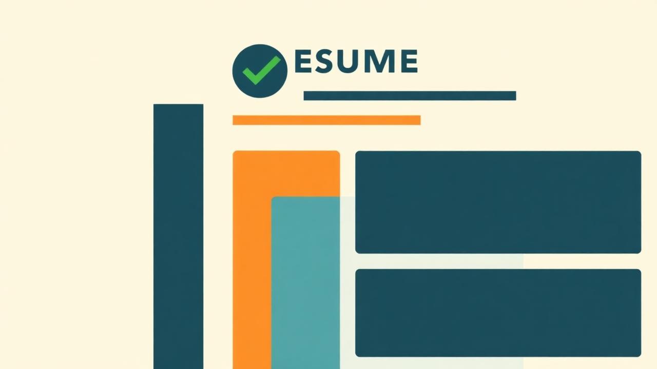
The fresher-friendly layout, top to bottom
Formatting rules that actually matter
Formatting rules that actually matter
- Use standard fonts (Calibri, Arial, Georgia, Helvetica) at 10–12pt
- Stick to one column — multi-column layouts can be read out of order by parsers
- Save as PDF unless the application explicitly asks for .doc/.docx
- Use consistent date formats throughout (Jan 2025 – Present, not mixed styles)
- Avoid headers/footers for contact info — some parsers skip them entirely
Section headers matter more than you'd think
Stick to conventional labels like "Experience," "Education" and "Skills" rather than creative alternatives like "My Journey" or "What I Bring." Parsers are trained on standard headers, and creative labels are a common cause of misread sections.
How recruiters actually scan a fresher resume
Recruiters hiring for entry-level roles typically spend six to eight seconds on the first pass, checking degree relevance, one or two standout lines, and overall neatness before deciding whether to read further. That's why the summary and skills sections sit near the top — they're doing the work of convincing someone to keep reading.
Want to build this exact layout without fighting with a Word template?
Build Your ResumeLayout mistakes freshers make most often
- Using a two-column "designer" template that scrambles when parsed
- Putting Skills at the very bottom, after weaker sections
- Listing every course taken instead of only the relevant ones
- Inconsistent bullet punctuation and verb tenses
- Leaving in placeholder text from a downloaded template